Weather App Analysis🌤️
Why do I enjoy the weather app so much? Why would I rather look at it over social media — or really any other app? The weather app is my favorite app. And, well, these are all great questions, especially because people usually look at me funny when I tell them that.
Today, we’re on a journey to figure out what makes it so satisfying. Is it just my overwhelming interest in the weather, or are actually good user experiences partially to blame? And how can the Apple and The Weather Channel weather apps compare against each other? What do they do right, and what do they maybe do wrong? Let’s find out!
First off, what makes a good user experience?
Usability — Keep It Intuitive and User-Friendly: The app should be easy to navigate and understand, with a clear layout, accessible navigation, and clear, intuitive interface.
Clarity — Make It Simple and Satisfying: The app should have a clean design with clear, concise text and icons. Presenting information in an organized and simplistic manner should allow the user to find the experience enjoyable, valuable, and fulfilling of their needs.
Personalization — Encourage User Empowerment: The app should offer personalized experiences, such as customized screens, profiles, and notifications. Allow users to achieve their goals and get the most out of their experience by creating engagement.
Performance — Don’t Keep Them Waiting: The app should be fast, responsive, and should not crash or freeze. This makes the product efficient and reliable with minimal downtime for the user.
Functionality — Consistency Is Key: The design and functionality of the app should be consistent throughout, ensuring a smooth user experience. Keeping the look and feel of the application consistent helps to fulfill the needs of the user and allows them to easily perform the tasks for which it was designed. This includes feedback, where the app provides immediate and relevant feedback to users, such as confirmations, error messages, and progress indicators.
Accessibility — Everyone Can Do It: The app should be accessible to all users, including those with disabilities. This includes keeping in mind things such as color, contrast, text size, concise language, predictable application behavior, text alternatives for non-text content, keyboard navigation, and much more.
Desirability — Play Their Heartstrings: The product or service should appeal to users on an emotional level with attractive and appealing design. Make them remember their experience and bring them back by associating positive emotions with the product.
Judgement time. What’s “yay” and what’s “nay”?
Apple Weather
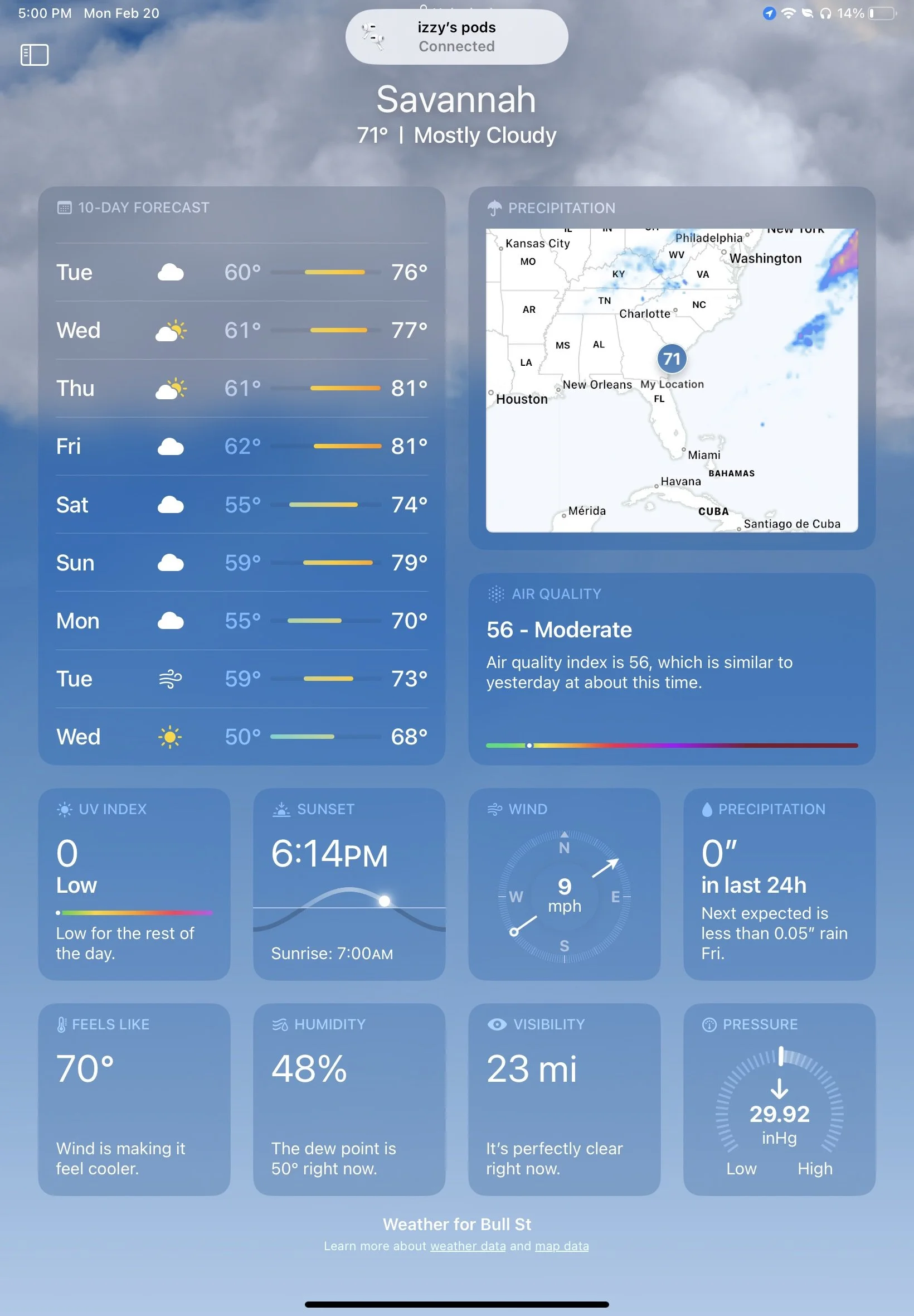
I think my favorite thing about this weather app is the clarity of all the information they provide, which in turn makes the app super usable. The most common stuff that people want to see are the first bits of information we see when we open the app. The current location, temp, and weather conditions are featured front and center, followed by the hourly and 10-day forecasts. This is what most people are coming to the weather app for, and Apple lays out the info in a manner that is easily digestible as well as visually consistent and desirable. We’ve also got some fun UX Writing that let’s us know what’s up with the conditions in the coming hours so we don’t even have to scroll through the hourly forecast to know what’s happening. We love that. People can go to the weather app, find what they need, and be in and out as quick as possible.
Again, this is most people. Oh but not me — I scroll. The best parts of the weather app are after the 10-day forecast. That’s where all the juicy info is, like sunrise/sunset times, wind speeds, humidity, THE FEELS LIKE TEMP, and much more. This information is also presented in a widget-format that follows their brand and gives the user the most important info in the simplest way possible. Shout-out again to the blurbs below the basic info that tell us just the right amount of additional information👩🏼🍳💋 You can also click into any of these widgets to see even more info, presented in a line graph so that the user can view the data in a simple, compressed manner rather than a long, overwhelming list. This improves functionality as most users are visually and operationally familiar with Apple’s widget system, so they would find the UI easy to understand and be able to infer that clicking to the widget’s offers more information.
Personalization of this app is pretty standard for weather apps, allowing users to add saved locations, select preferred temp units, and change notification settings. Apple also let’s you change the order of your locations which is nice since you can scroll through them — no one wants to scroll through a bunch of locations just to get to the one you want to see. I kinda wish we were allowed to customize what widgets we want to see (more so on The Weather Channel app, but we’ll get there). I mainly say this just because I really want to see the moon phases on here but there’s no way to add them, and I haven’t been able to figure out how to view them. I know you have this information, Apple. I can see the current moon phase on my lock screen, so let me look at the upcoming ones too. I’m calling you out.
The app has very nice contrast, consistent language in UX Writing, and predictable behavior, making it overall pretty accessible. I’ve also done a little more research into accessibility features and you can increase text size, add button shapes, smart invert the app colors, reduce screen motion, increase the contrast, reduce the transparency, and all sorts of other things to assist with visual impairment.
The performance of the app is great too, with rare glitches and lags, users can get what they need without having to wait. When users have to wait too long, they’ll just close the app and be left with a negative emotional perception of said application. As much as I love the Apple weather app, this is how I feel about their precipitation radar feature. Whenever I try to use this feature, it takes foreverrr to load and when it does load, it struggles to stay that way and lags all over the place. This is where I usually click over the The Weather Channel app…
The Weather Channel
This bad boy is a whole ‘nother story from why I enjoy the Apple weather app. Now, for Apple, I ran through [almost] every aspect of its UX, but for The Weather Channel, I just want to focus on what makes it special.
Of course, The Weather Channel app is host to a lot more information in terms of both detail and variety. It offers its users a more in-depth look into why the weather is what it is, what the weather will be like that day, daily forecasts past 10 days, and of course every other piece of information that Apple offers. And their radar is much more responsive and with greater performance. The do offer basic widgets that bring more clarity to the information presented if you don’t want to go through all the nitty gritty details. Plus, they’ve got the moonrise and moonset times😉
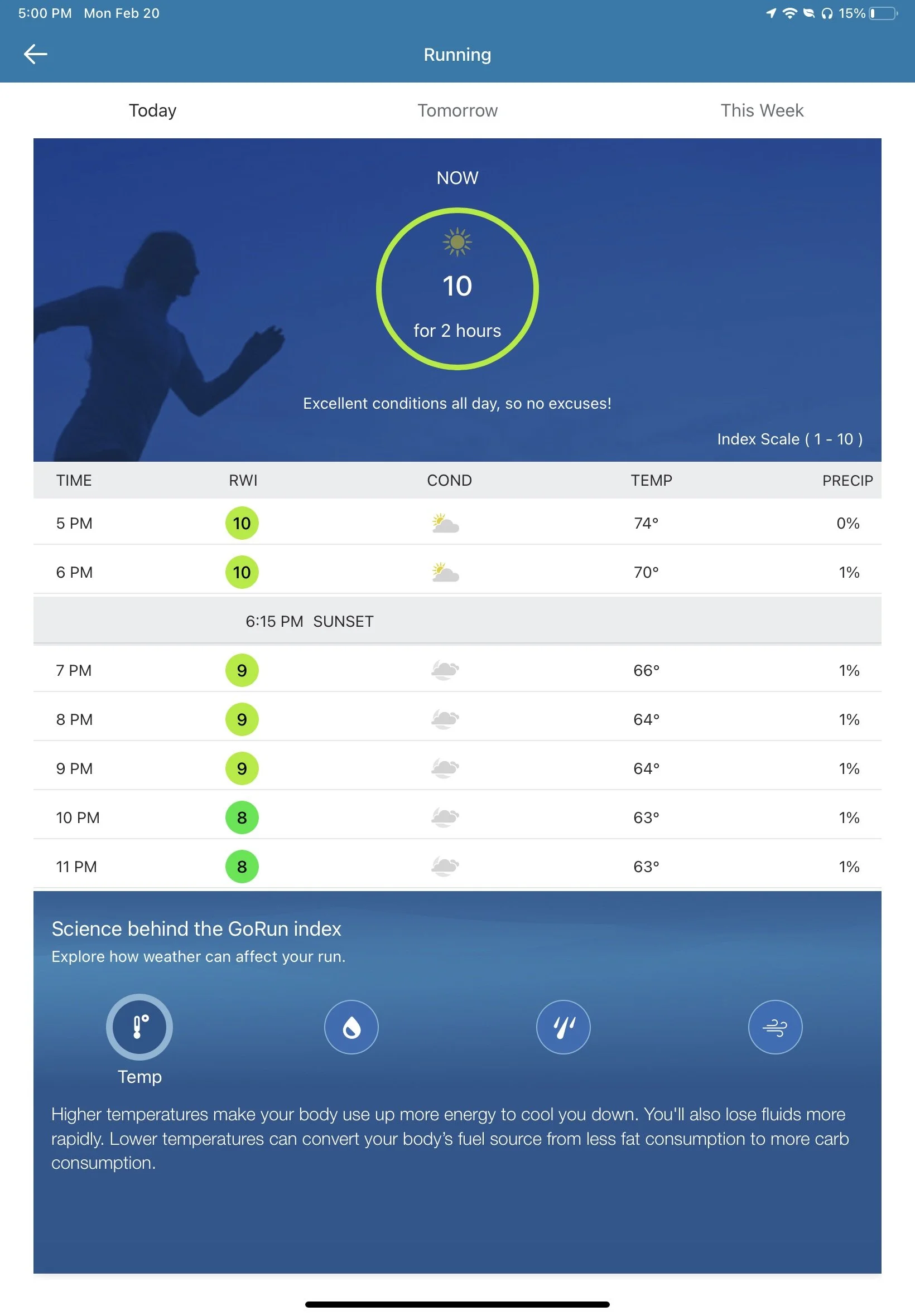
With the widgets, I do wish that there was more personalization, as some of the information is repeated and others unnecessary—at least for me. Even with this, some of the widgets offered will always bring me back to The Weather Channel app. Included in this are the Outdoor Conditions/Health and Activities widgets and the Latest News widget. The news one offers great information on storms, jet streams, conditions in my area and even across the country, as well as relevant world news relating to weather. Simply one of my favs because I love knowing why the weather is all over the place. Now, the Outdoor Conditions is just fun. It tells you about flu and allergy risks in your area, dry skin indexes, mosquito activity, and the best part (in my personal opinion), running conditions.
These are all awesome ways to give you more information about the weather in your area without overloading you with information. They’re presented in a desirable manner with simple graphs so you can get the info you need and get out. The option does exist for you to click into each condition and learn more about why they score it the way they do. I love this transparency. It allows the user to gather more data while also creating trust between them and The Weather Channel. The app isn’t just asking the user to give it unearned trust, instead the app is illustrating why you should trust said information.
TLDR aka What’s the Verdict?
Long story short, part of my love of the weather app most definitely comes from an interest in the weather itself and wanting way more information on it than necessary. But, through this analysis, I have discovered that I also love these apps due to their clarity of information, functional widget structure, and consistent—and let’s face it—gorgeous UI. I also just love the fact that I can have The Weather Channel tell me when to run so I don’t have to think about it.
What have we learned? I’d say we’ve learned that the way in which you present information creates an experience that someone wants to come back to time and time again. Both apps know that most users want to basic information presented straight up and have the most commonly searched for info at the top. And both also allow users to explore more information if they want by clicking into specific widgets or exploring tabs. This creates a personal experience for every user and gives information in an easily digestible manner. Not to mention they both tell you when you should putting on that good ole sunscreen.


